上一篇文章学习了Flex布局的语法,今天来个经典的布局实例练练手。
圣杯布局
圣杯布局由页头 (header),中间部分 (center),页脚 (footer),和三栏组成。中间的一栏是主要内容,左边和右边提供如广告、导航的链接。
大部分的 CSS 解决方案都是以下列为目标:
- 边栏应流动居中,定宽。
- 中间一栏 (主要内容) 在 HTML 源码中应该首先元素出现。
- 所有栏同高,忽略实际高度。
- 使用的 HTML 标记尽量少。
- 当页面内容不够充满页面时,页脚应“粘”在底部。
html代码
1
2
3
4
5
6
7
8
9
| <div id="app">
<div class="header"></div>
<div class="container">
<div class="center">一些内容</div>
<div class="left"></div>
<div class="right"></div>
</div>
<div class="footer"></div>
</div>
|
不幸的是,这些自然的需求由于原生css的限制,当前经典的圣杯布局的解决方案都不能完美满足以上所有的要点。
有了 Flexbox 布局,终极的解决方案终于成为可能。
我们先看传统的实现方式:
1
2
3
4
5
6
7
8
9
10
11
12
13
14
15
16
17
18
19
20
21
22
23
24
25
26
27
28
29
30
31
32
33
34
35
36
37
38
39
40
41
42
43
44
45
46
47
48
49
50
51
52
53
54
55
56
| #app {
position: relative;
min-height: 100vh;
padding-bottom: 100px;
box-sizing: border-box;
min-width: 600px;
background-color: #ddd;
}
.header {
position: relative;
height: 100px;
background-color: #444;
}
.container {
padding-left: 200px;
padding-right: 150px;
overflow: hidden;
}
.center, .left, .right {
position: relative;
float: left;
padding-bottom: 20000px;
margin-bottom: -20000px;
}
.container .center {
width: 100%;
background-color: silver;
}
.container .left {
margin-left: -100%;
left: -200px;
width: 200px;
background-color: blue;
}
.container .right {
margin-left: -150px;
right: -150px;
width: 150px;
background-color: orange;
}
.footer {
position: absolute;
left: 0;
bottom: 0;
width: 100%;
height: 100px;
background-color: #444;
}
|
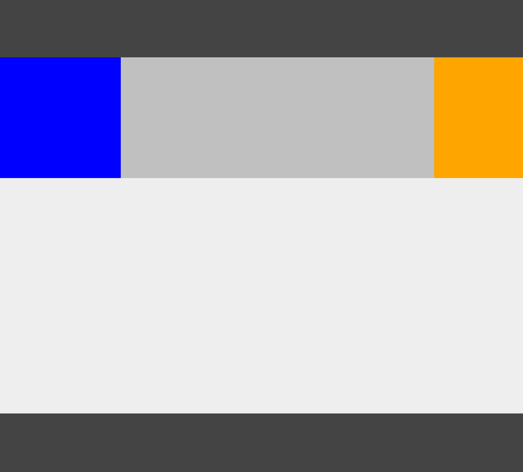
实现非常繁琐复杂,不易理解,而且使用了一些奇淫巧技实现列的等高效果,稳定性上难以保证。效果如图:
再看flex的实现:
1
2
3
4
5
6
7
8
9
10
11
12
13
14
15
16
17
18
19
20
21
22
23
24
25
26
27
28
29
30
31
32
33
34
35
36
37
| #app {
display: flex;
flex-direction: column;
min-height: 100vh;
}
.header {
position: relative;
height: 100px;
background-color: #444;
}
.container {
flex: 1;
display: flex;
}
.container .center {
flex: 1;
background-color: silver;
}
.container .left {
flex: 0 0 200px;
order: -1;
background-color: blue;
}
.container .right {
flex: 0 0 150px;
background-color: orange;
}
.footer {
height: 100px;
background-color: #444;
}
|
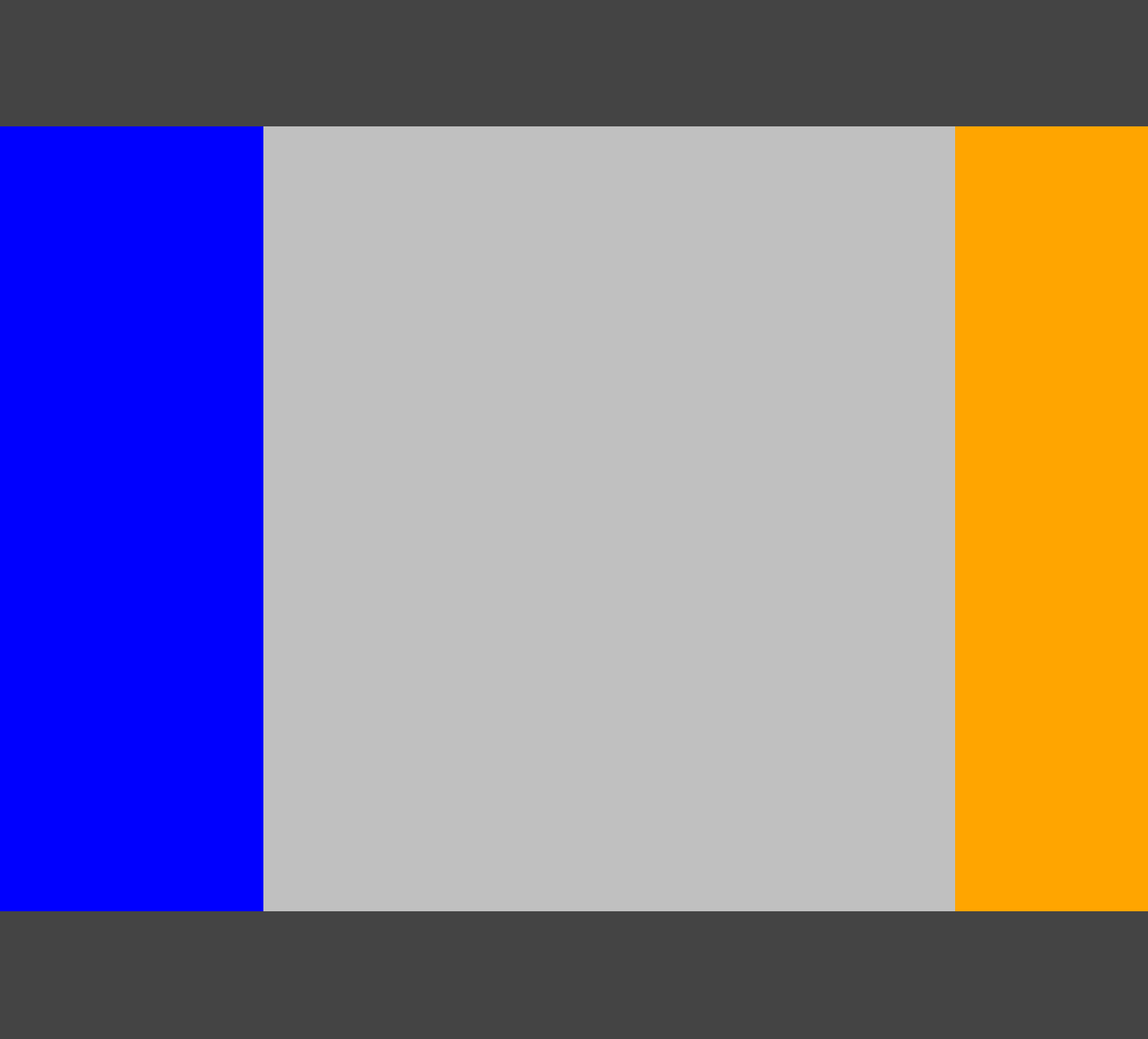
简洁明了,实现方式及效果堪称完美,如图:
参考:
- In Search of the Holy Grail
- Solved by Flexbox